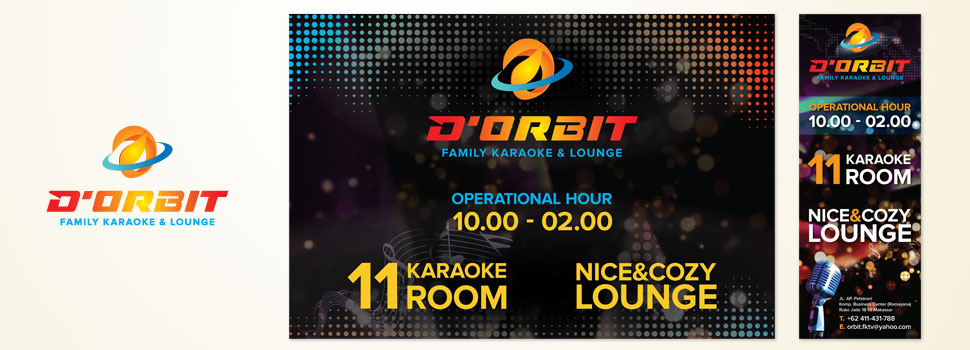
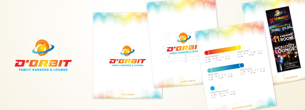
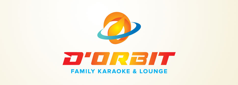
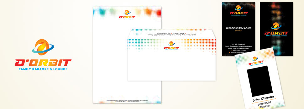
D’Orbit is a brand that specializes in family karaoke & lounge. Orbit is a path traversed by the object, around other object, within the influence of a certain mode. D’Orbit’s logo symbolized as a planet at the same time form the D letter. Visual identity displayed use a lot of light colour on a dark background (black).In the context of the existence of the orbit, the black colour symbolizes the space, while the bright gradation colour (orange, yellow, cyan) represent the colours of the galaxy and something shining bright and attractive or “eye catching”. Typography type used in the logo also has futuristic, powerful, and modern image, apt to the image to be displayed from the brand’s owner. Overall, the brand owner hopes that D’Orbit can also “stand out” and foremost in its class, and become the centre of attention because it can win the hearts of the target market.
Website: –
Client Since (Year): 2015
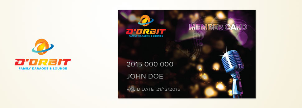
Scope of Projects: Branding (Brand Identity Development), Stationery Production, Banner, Member card, Signage.

Recent Comments